

Like these posts on LED lighting?
Click here to see them all.
LED lighting is like any other technology. It started out pricy, primitive, and with lots of tradeoffs. Most of the drawbacks have been methodically reduced or eliminated as the technology matures and more people adopt it as the new standard for lighting. Today, when you’re lighting a home, and especially when you’re lighting a serious art collection at home, you have a lot of latitude in finding outstanding LED options you’ll be happy with in the long term. But there is a lot to learn about picking the right LEDs, beyond just how bright they are.
The color temperature of light has a profound impact on how we perceive it. But color temperature isn’t the same thing as color. I’m not talking about pure red light or green light or what you get using color filters in front of light bulbs. Color temperature is a feature of white light.
Know how light from a candle looks sort of yellowish orange? And light from an overcast sky looks like a bluish-grey? Both are full-spectrum white light, and things lit by either light show their true colors. But light with different color temperatures gives everything it illuminates a different character.
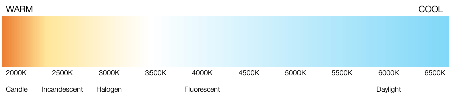
Color temperature is measured in degrees Kelvin. Why that is true is a consequence of the physics of light that doesn’t much matter for this discussion. One thing that is very confusing though: “warm” light – yellowish white, say 2500K to 4000K has a lower color temperature than “cool”, bluish white light, say 5000K – 6500K. Yup, “warm” is cooler, “cool” is hotter. Weird, huh?
Why doesn’t light at different color temperatures make things look yellow or blue? Think about how a green grass lawn looks green both mid-day, when the light is stronger at the blue end of the spectrum, and dusk, when red wavelengths predominate. This is a feature of human visual perception called color constancy, and it is a good thing. Stuff looks the same color and we can identify it, even under very different illumination. We only really notice the color temperature of light, when we see a scene illuminated by light with multiple different color temperatures. For example, incandescent light illuminating a work of art in an atrium flooded by natural light, will look yellowish compared to the skylit interior.
Ah ha! That leads us to rule number one:
Rule 1: Pick one color temperature for your lighting, and stick to it.
“Wow, what an… interesting… contrast in color temperatures you’ve got here for your lights!” is something you never want to hear. Or even have someone think. You want color temperature to be invisible. The only way to make that happen is to have just one color temperature for your lighting.
Color temperature doesn’t change how colors are perceived, due to color constancy. But it does seem to affect mood. Light at warmer color temperatures seems more “homey” and “relaxing”. Light at cooler color temperatures seems more “utilitarian” and “active”. And when light is subdued, warmer color temperatures seem more “pleasant”, but when the light gets bright, cooler color temperatures feel better. This relationship was studied in the 1940s when fluorescent light with its cooler color temperature was a new thing, and lighting designers started wondering about when and how to use this new technology. Dutch physicist A. A. Kruithof collected subjective impression data to establish how people perceive different color temperatures at different brightness levels.
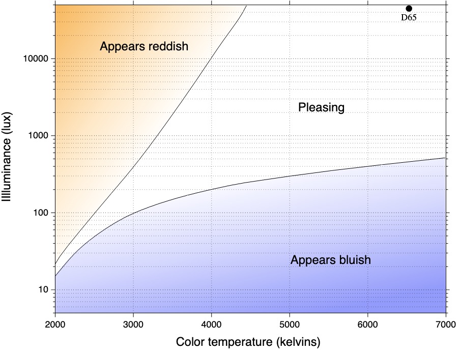
At lower light levels such as those we experience indoors at night, warmer whites are more pleasing. At higher light levels closer to what we experience outdoors, cooler whites are more pleasing. The reason for this is simple – in low light, rod cells in our eyes provide more of our vision. These cells are highly sensitive to blue light. In bright light, cone cells are more important in creating perceived vision, and those cells are more uniformly sensitive to the full spectrum.
Another study using a specially designed lighting system that can deliver constant light levels but at varied color temperatures was used to light an assortment of museum art objects, and people’s subjective response to these differing color temperatures was studied. Surprisingly, most subjects chose a color temperature within a very narrow range as the optimum for art: about 3700K. Further studies showed that when shown a white reflective surface at different color temperatures, subjects rated 3700K as the “neutral” non-colored white, with other color temperatures assigned warm or cool subjective impressions, within a narrow band of about plus or minus 200K.
So that’s settled, then. 3700K is the best color temperature for a fine art collection at home!
Hold on… not so fast. You can’t readily buy 3700K LED bulbs or light sources. Your standard choices for residential bulbs and fixtures are 2700K, matching incandescent, 3000K, matching halogen, 4000K matching fluorescent, and >5000K, matching daylight.
In an art gallery or museum, 3700K at moderately high lux levels – say, 200 – 500 lux, would likely be an optimum choice for displaying art. Museums and galleries are places where you’re there to actively experience the art. Your mind is engaged, you’re focused – its an environment where the more “active” cooler color temperatures closer to 4000K and above are appropriate. Since LEDs emit almost no damaging IR or UV wavelengths, they preserve delicate art better than older light sources and can be used at higher lux levels, but some art media such as watercolors and silver emulsion photographs are so prone to fading under bright light that curators and collectors are careful to limit their exposure. If I had a big budget, I’d spend the money and buy commercial LEDs tuned to 3700K. If I had a moderate budget, I’d probably test both 4000K and 3000K LEDs and see which I thought was better for the artwork I wanted to exhibit. If I needed to use lower light levels for more delicate artworks, warmer light would likely be more pleasant, and 3000K would likely win in that situation.
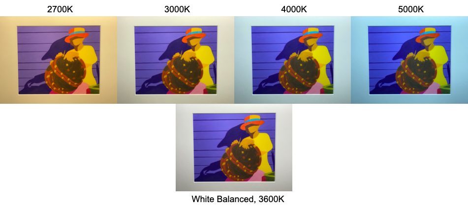
Here is a piece of art photographed at different color temperatures. This is what the camera actually sees – but the color shifts look exaggerated here because cameras do not possess our vision’s color constancy! That’s why cameras have manual white balance adjustments or sophisticated AI to compensate. Your eye will see something close to the white balanced image under any of these color temperature sources, but with a slight cast towards warm or cool, and a different “mood” – relaxed or energized – depending on the relative warmth or coolness of the source.
At home, 4000K to my eye feels too much like being in a store, or an office – not relaxing, not “easy on the eyes”. 2700K is the color temperature of the most common incandescent bulbs most of us grew up with. But that color feels too warm to my eyes for appreciating art. It is too far from “neutral”. It is surprising how much more “crisp white”, 3000K appears compared to 2700K. It still appears warm and cozy but closer to a neutral color. 3000K is not too energetic, clinical, utilitarian. If you’re not really into art, and you’re lighting your home for mood and to highlight furnishings, especially wood, 2700K is a popular choice. But if you want to use affordable LEDs to light your home so that it remains cozy and relaxing, and at the same time make your fine art collection really pop off the wall, then:
Rule 2: 3000K is the best color temperature for a home with a fine art collection.
I know – how presumptuous of me to say one choice is “best” for something so subjective. But try it – you’ll see. Other available and affordable choices are too warm or too cool. 3000K looks both neutral with art, and warm and cozy, at the same time. Of course, its your choice, but there’s a reason 3000K is such a popular and widely available choice for residential bulbs and fixtures, and why so many decorators and lighting designers favor it.
One other thing to note about LEDs – their color temperature remains constant even when they’re dimmed. Incandescent and halogen sources tend to shift warmer as they are dimmed. The latest trend in LED lighting mimics this warm shift when dimming, so these LEDs don’t keep a constant color temperature at different light levels. I don’t recommend these warm-shift LEDs. It is great that LEDs can retain their color temperature at all light levels – a feature, not a defect.
Credits – all photos and images here were created by me except for the Kruithof Curve image, which is public domain and published on Wikipedia.
